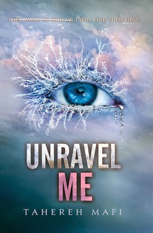
It's time for Top Ten Tueday hoisted by The Broke and The Bookish!
This week's theme: Ten Book Cover Trends I Like/Dislike
I chose 5 I dislike and 5 I like. Here we go:
Dislike:
1. Photos of real people: I know this is a very popular thing with books, but I don't like it because I can no longer allow my imagination to create this person. I see the person before I have a chance to even crack open the book, and that person is all I will see.
2. Almost kissing: It's really overdone. I am just not a fan.
3. Eyes: Eyes creep me out. That is it.
4. Half faces: This is also very popular and it just drives me crazy.
5. Faceless chiseled abs: I realize I may be the ONLY girl to feel this way, but I feel like it cheapens the whole book. I feel like they are trying to sell me on the picture, not the book.
Like:
1. Shadowy Figures: I love the mystery of a shadowy figure!
2. Abstract elements that become clear at some point during the book: I love that "ah-ha" moment when you realize why the cover is what it is.
3. Simplicity: I like it simple.
4. Drawn art: And I love drawn art. I definitely would want to commission an artist when I write a book.
5. Black and white: There is something simple and elegant about a black and white cover.


Oh, I love covers where it's obvious the artist had read the book <3
ReplyDeleteAnd those buff, half naked guys? No thank you!
Cora @ Tea Party Princess
I love knowing the cover is purposeful and not interchangeable.
DeleteDefinitely agree on the dislikes - half naked guys and other romancey-type covers discourage me from picking up the book.
ReplyDeletehttp://readrunstudy.wordpress.com/2014/06/24/top-ten-book-cover-trends-i-likedislike/
Ditto! I avoid them based on the cover.
DeleteHate: pictures of feet (when the picture is just feet, not when the picture is a whole person who has feet!). Oh, and I hate it when the author's name is bigger than the title.
ReplyDeleteUgh feet! That's a good one. And there are a few books where I thought the title was the author's name, so I agree.
Delete